スタートページ> JavaScript> 他言語> Python 目次> ←棒グラフ・折線グラフ →散布図
Python でグラフを作成するには、アドオンライブラリの Matplotlib を使います。
ここでは Matplotlib のコンポーネント matplotlib.pyplot を用います。
import matplotlib.pyplot as plt
Matplotlib 自体はデータの加工機能はもっていませんので、NumPy も使います。
下記の青線の部分をGoogle Colaboratryの「コード」部分にコピーアンドペースト(ペーストは Cntl+V)して実行すれば、右図の画像が表示されます。
ax.hist(x, options)
    options:
        bins=10                 # 棒の数。(デフォルト値: 10)
        range=(xmin, xmax)      # 横軸の棒の横軸の最小値と最大値
        color                   # 棒あるいは線の色(配列指定もできる)
        edgecolor=None          # 棒の枠線の色
        linewidth=4             # 線の太さ
        rwidth=1                # 各棒の幅(配列指定もできる)
        align='mid'             # 各棒の中心を X 軸目盛か。left’,right’
        cumulative=True         # 累積ヒストグラムのとき
        stacked=True            # 複数系列での積上げヒストグラム。
        orientation='vertical'  # 棒の方向。’horizontal’ (水平方向)
        histtype='bar'          # 棒の形状(デフォルトはbar)
                 'step'         # 線 塗りつぶしなし
                 'stepfilled'   # 線 塗りつぶしあり
        label=['x1','x2']       # 凡例での系列名
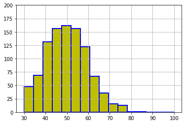
  大量データが対象になるので、ここでは正規乱数を発生させて入力データ x とします。
      np.random.normal(平均, 標準偏差, 個数)
      x = np.random.normal(50, 10, 1000)
  そのため、ここに掲げたグラフと、実行した結果のグラフは一致しません。
import numpy as np
import matplotlib.pyplot as plt
# 入力データ(正規乱数)
x = np.random.normal(50, 10, 1000)    # (平均値, 標準偏差, 発生個数)

# ax 設定
fig = plt.figure()
ax = fig.add_subplot(1,1,1)

# ヒストグラム作成
ax.hist(x,
        bins=16,             # 棒の数16
        range=(30, 100),     # 棒の最小値と最大値 はみ出した棒は表示されない
        color = 'y',         # 棒の色
        edgecolor='b',       # 棒の枠線の色
        linewidth=2          # 線の太さ
       )

# 図の体裁
ax.grid()
ax.set_ylim(0, 200)
# 表示
fig.show()
ax.hist では、棒数を与えるので、x軸目盛りの中央に棒があるようにはなりません。
それが重要な場合は、刻み幅を与えて集計し、それを棒グラフ(ax.bar)で作図することになります。
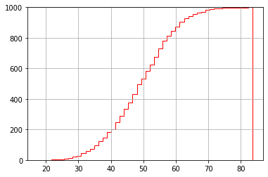
import numpy as np
import matplotlib.pyplot as plt
# 入力データ
x = np.random.normal(50, 10, 1000)
# ax 設定
fig = plt.figure()
ax = fig.add_subplot(1,1,1)
# 累積図作成
ax.hist(x,
        cumulative=True,     # 累積
        histtype='step',     # 塗りつぶしのない線
        bins=50,             # 棒の数を大にして曲線に近くする
        color = 'r'          # 線の色
       )
# 図のオプション
ax.grid()
ax.set_ylim(0, 1000)
# 表示
fig.show()
右側の縦線を非表示にする方法を私は知りません。
個別に2つのグラフを重ね合わせます。
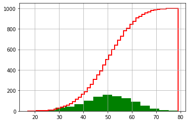
import numpy as np
import matplotlib.pyplot as plt
# 入力データ
x = np.random.normal(50, 10, 1000)
# ax 設定
fig = plt.figure()
ax = fig.add_subplot(1,1,1)
# ヒストグラム作成
ax.hist(x, bins=16,color = 'g')
# 累積図作成
ax.hist(x, cumulative=True, histtype='step',
           bins=50, color = 'r', linewidth=2)
# 図の体裁
ax.grid()
# 表示
fig.show()
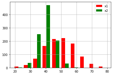
import numpy as np
import matplotlib.pyplot as plt
# 入力データ
x1 = np.random.normal(50, 10, 1000)
x2 = np.random.normal(40,  5, 1000)
# ax 設定
fig = plt.figure()
ax = fig.add_subplot(1,1,1)
# ヒストグラム作成
ax.hist([x1, x2],                     # 2系列
        color =  ['r', 'g'],          # 棒の色
        label = ['x1', 'x2']          # 凡例での系列名
       )
# 図の体裁
ax.grid()
ax.legend()                           # 凡例表示
# 表示
fig.show()
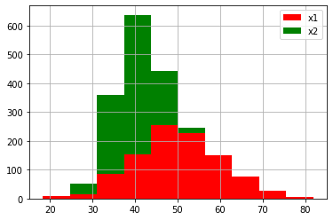
import numpy as np
import matplotlib.pyplot as plt
# 入力データ
x1 = np.random.normal(50, 10, 1000)
x2 = np.random.normal(40,  5, 1000)
# ax 設定
fig = plt.figure()
ax = fig.add_subplot(1,1,1)
# ヒストグラム作成
ax.hist([x1, x2],                     # 2系列
        stacked=True,                 # 積上げ
        color =  ['r', 'g'],          # 棒の色
        label = ['x1', 'x2']          # 凡例での系列名
       )
# 図の体裁
ax.grid()
ax.legend()                           # 凡例表示
# 表示
fig.show()